
Select Stills
Look Breakdown
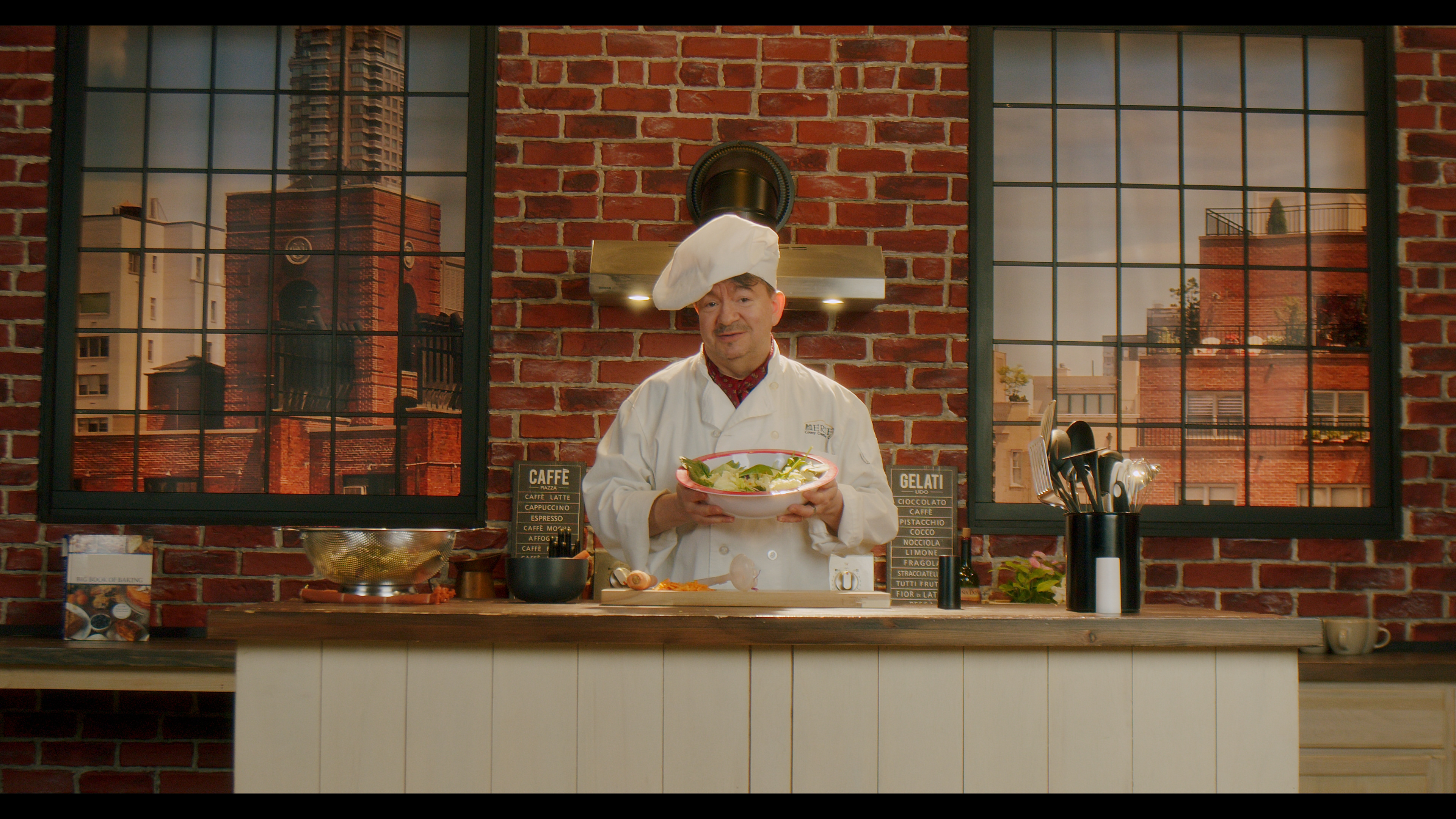
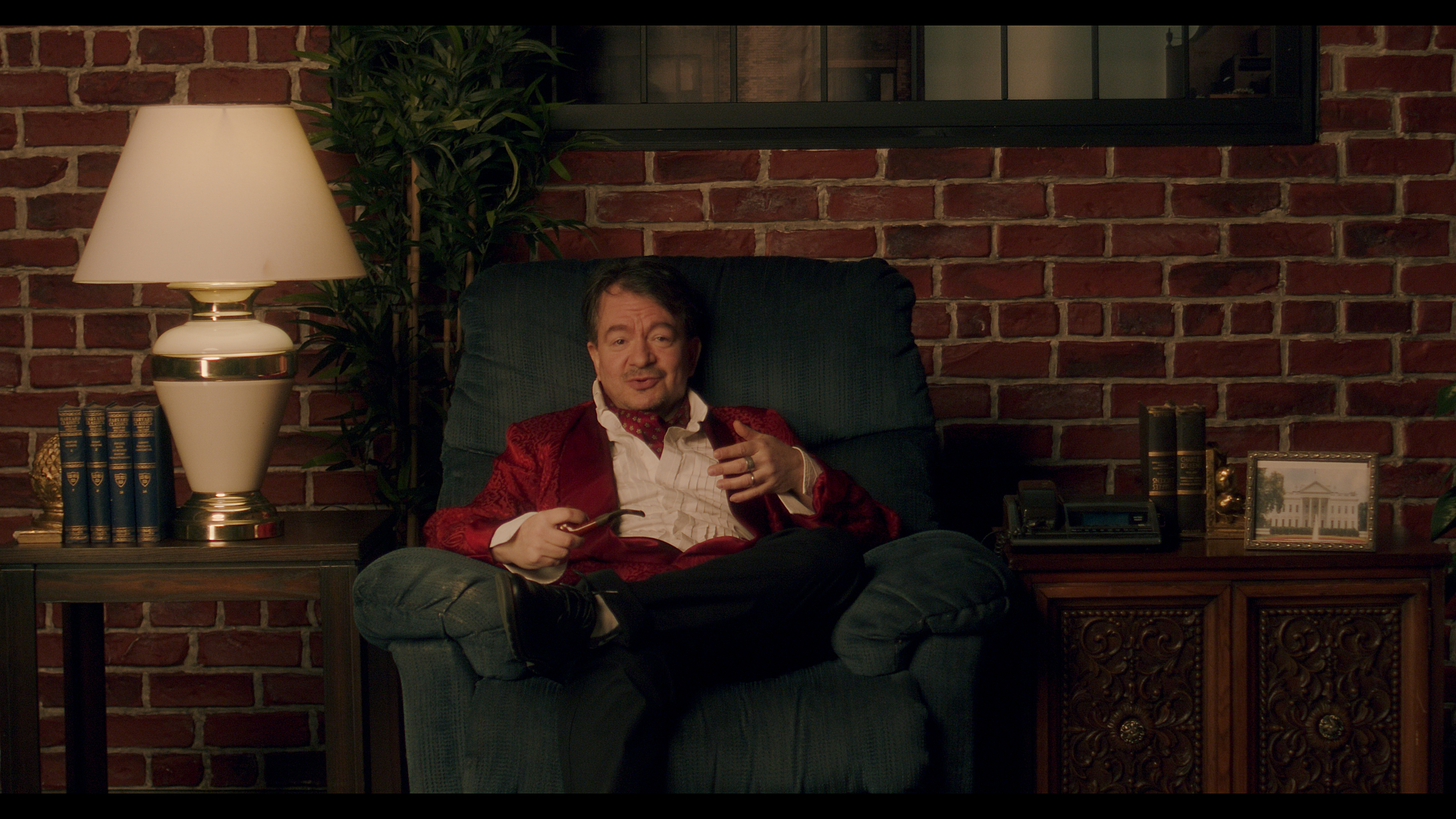
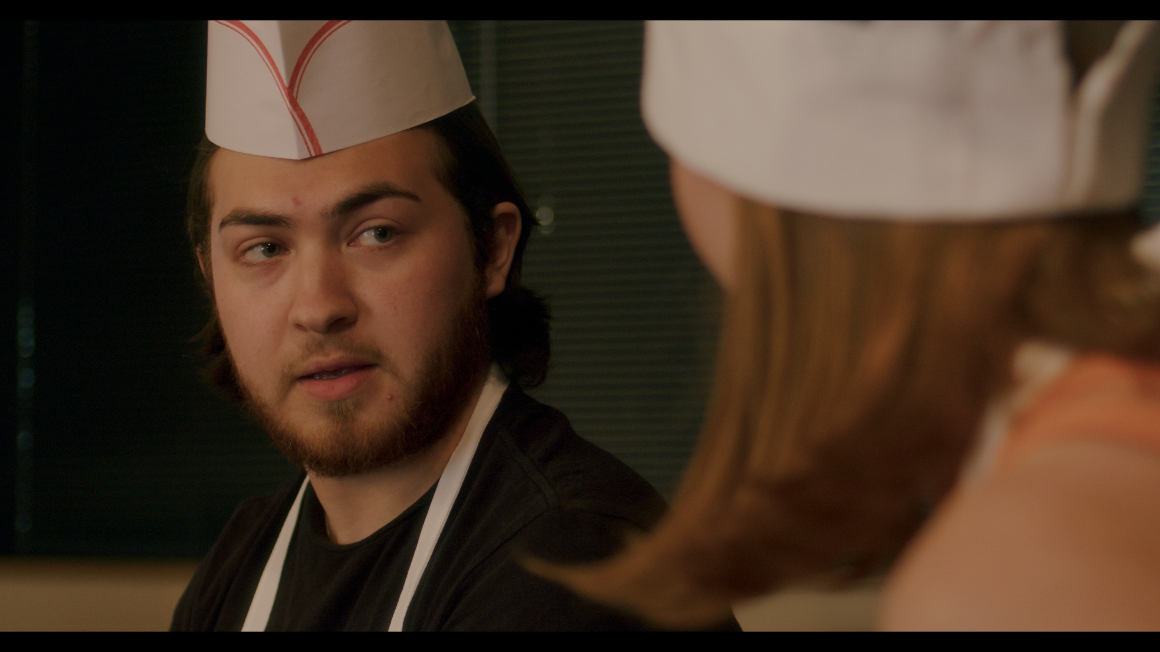
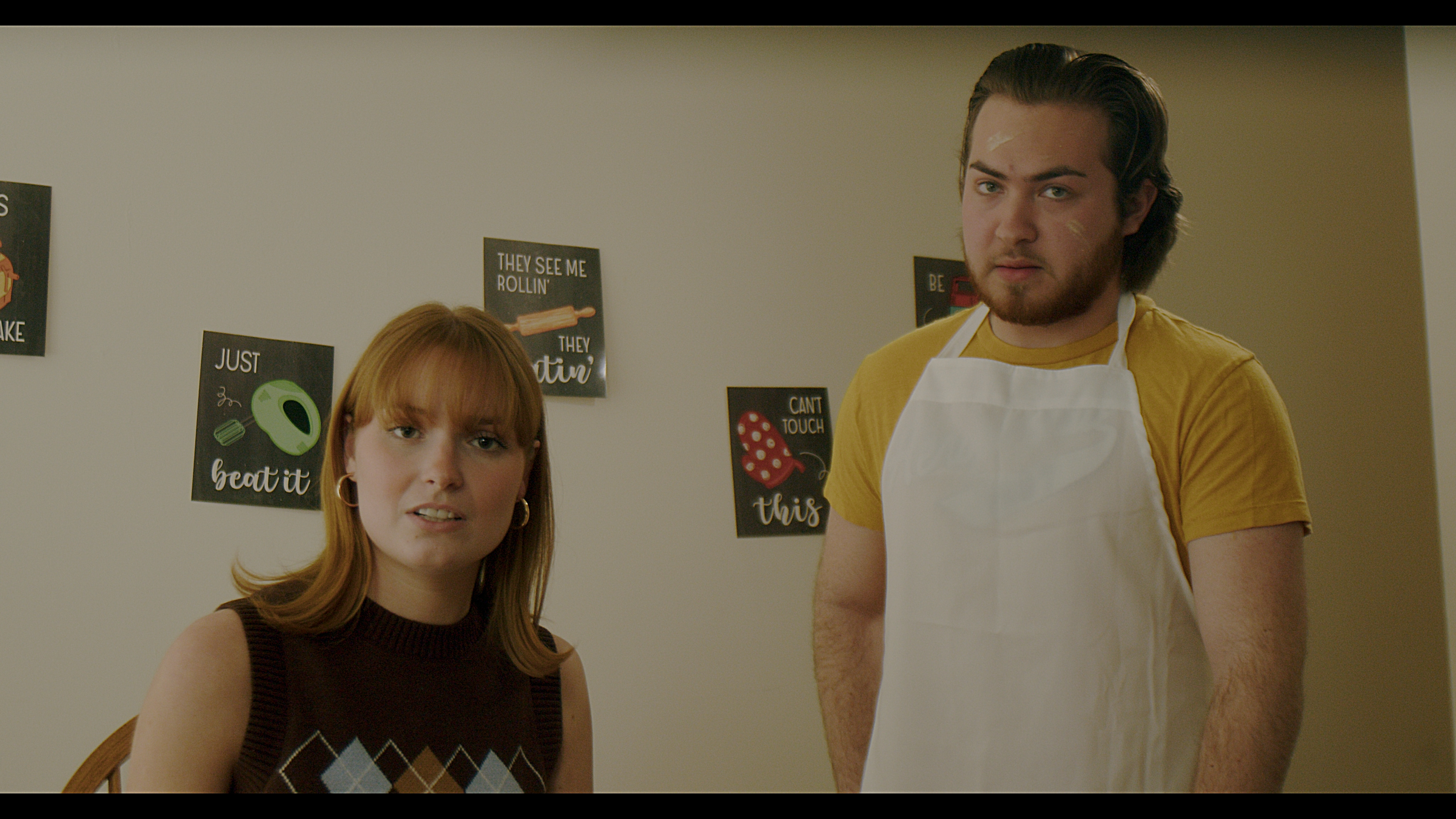
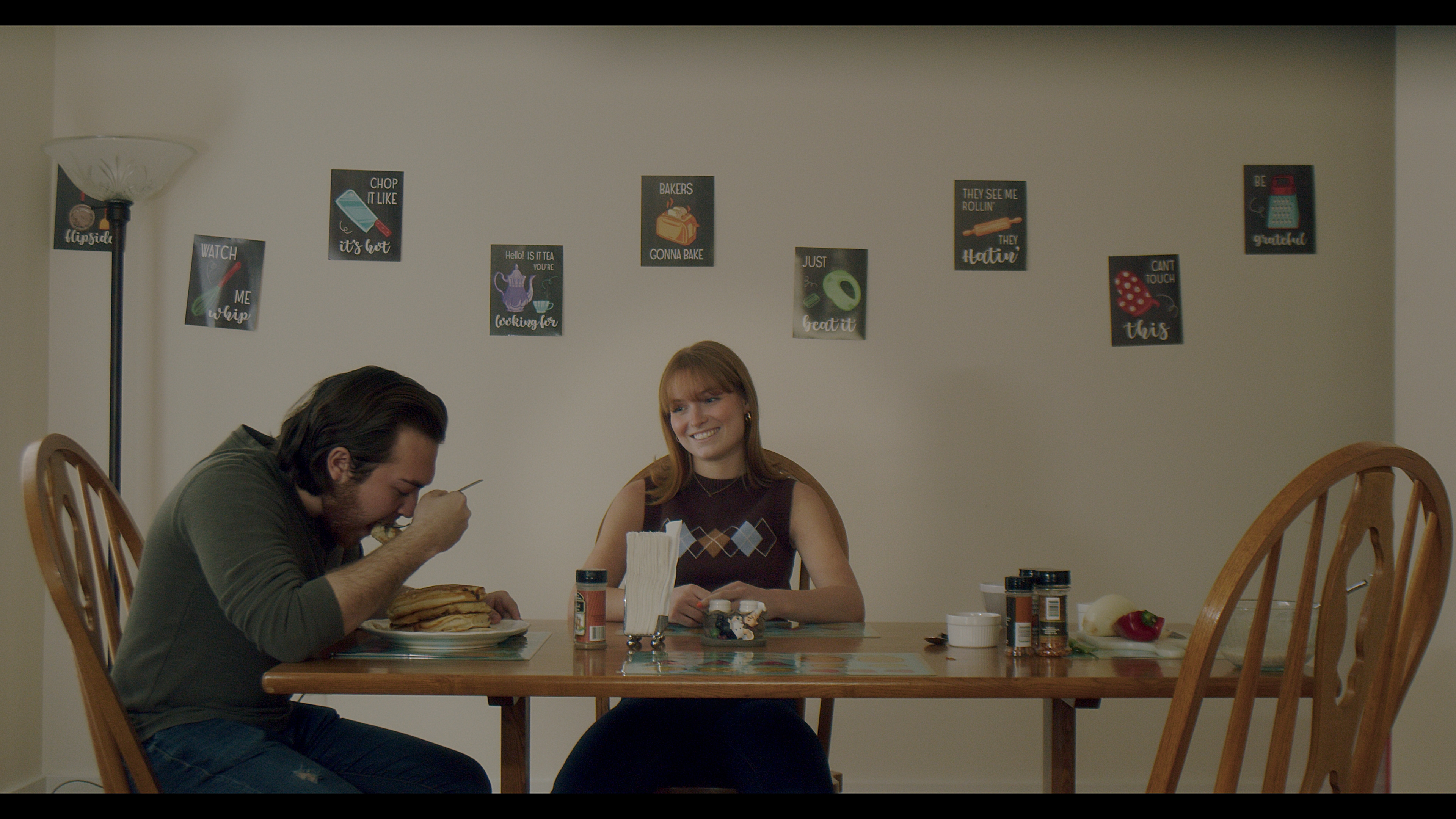
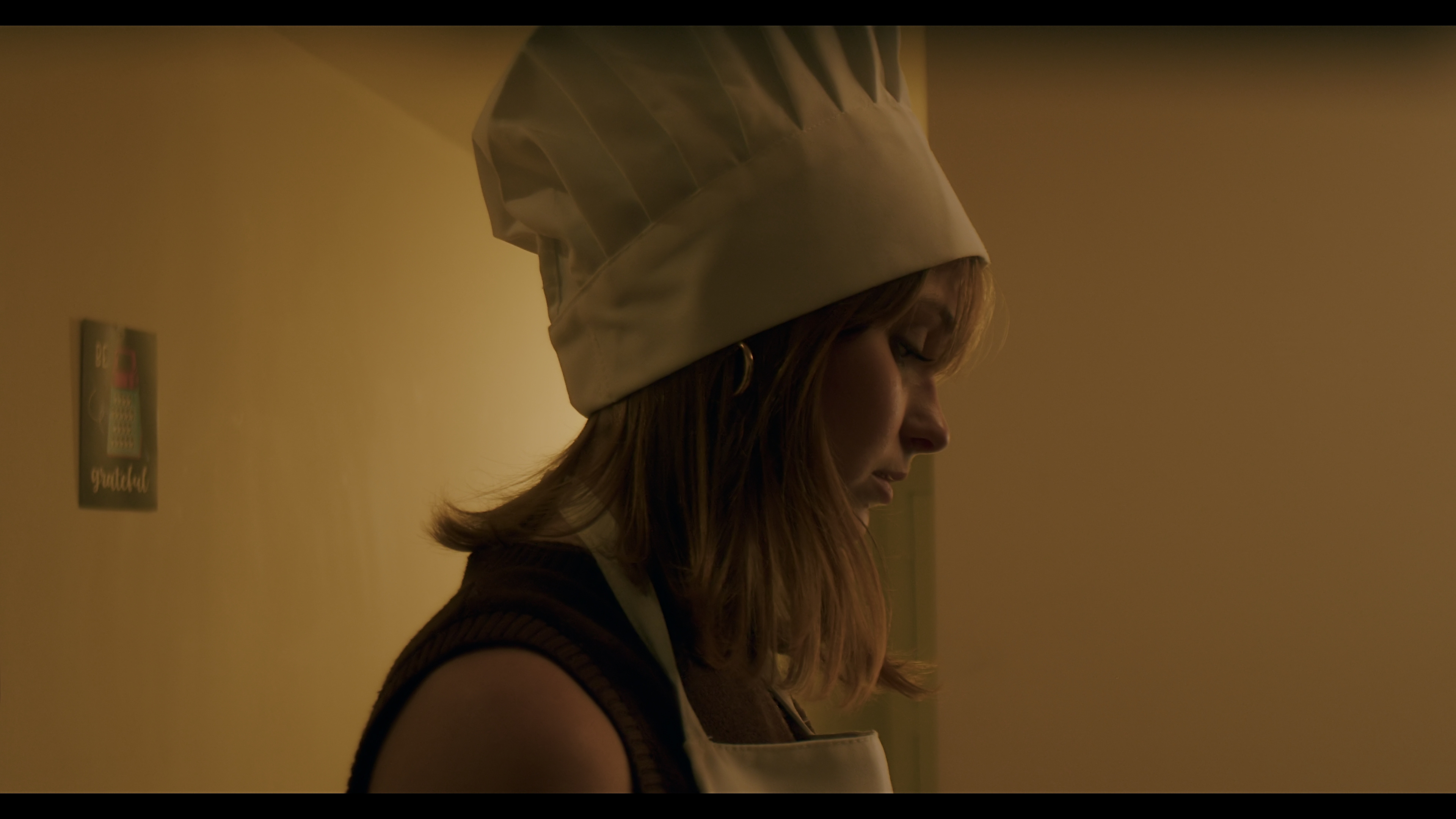
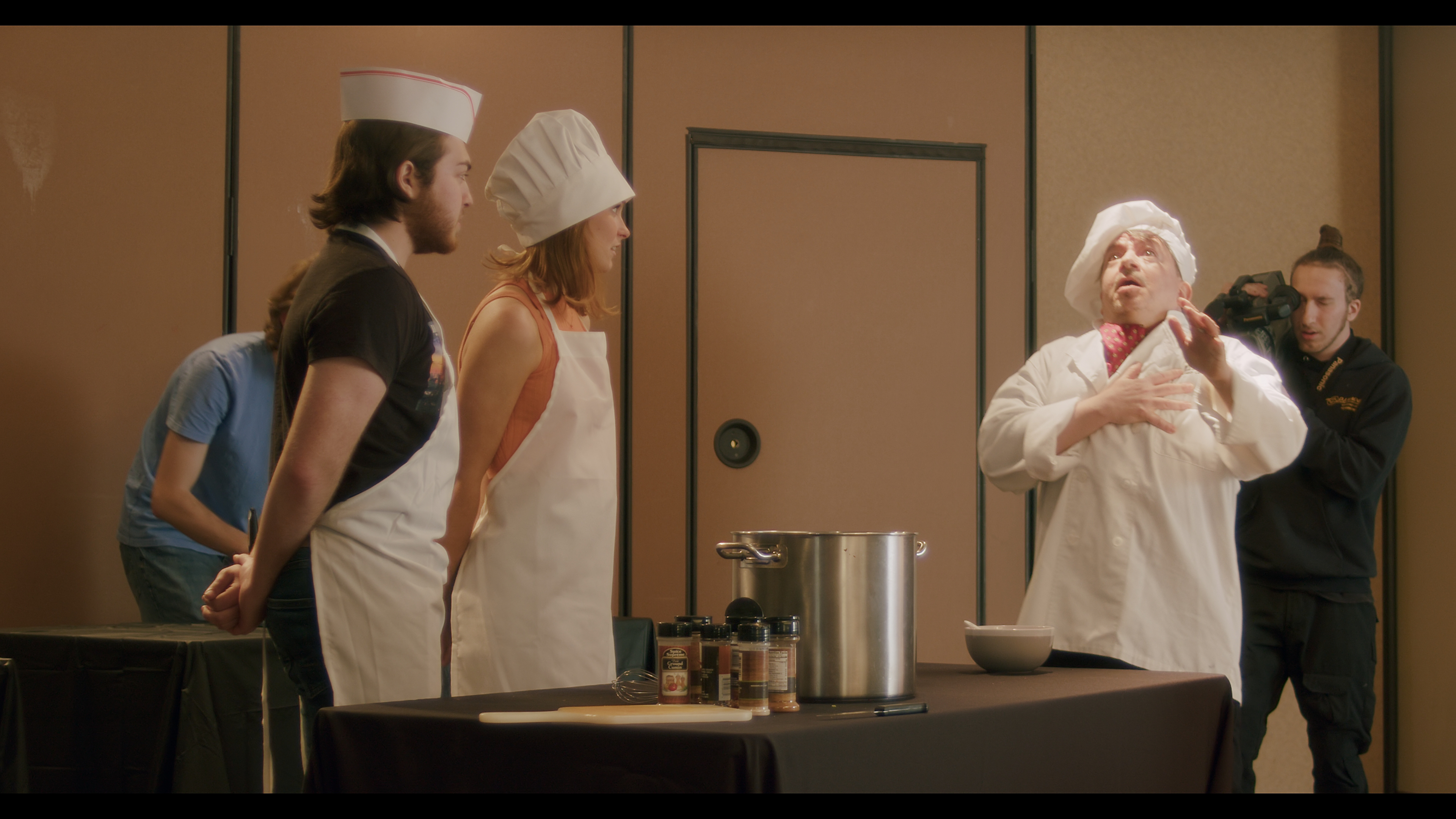
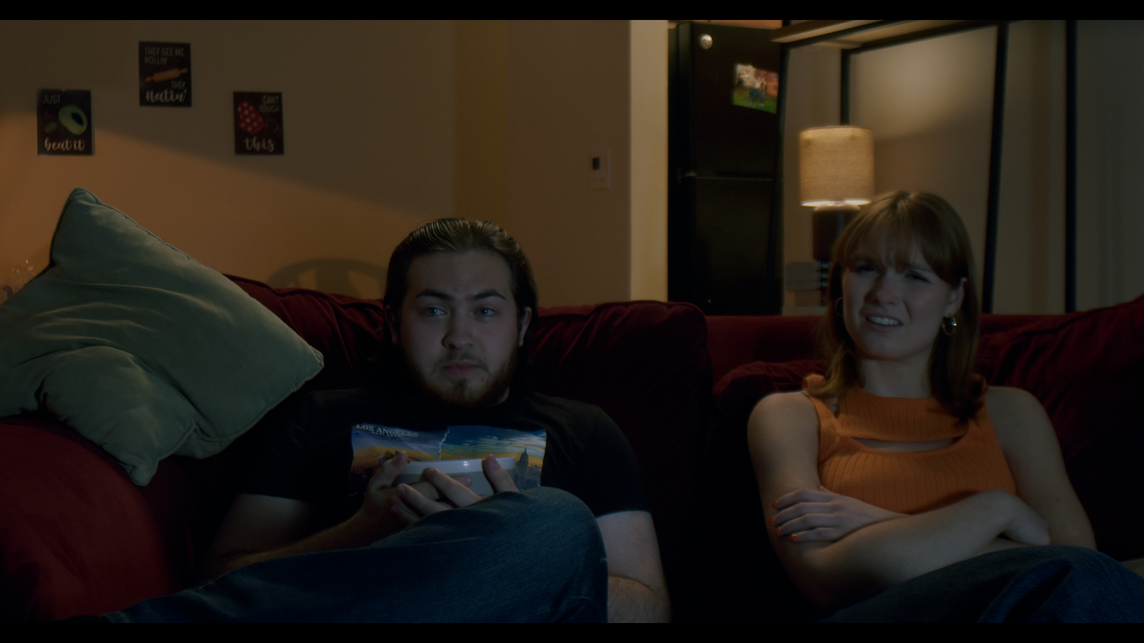
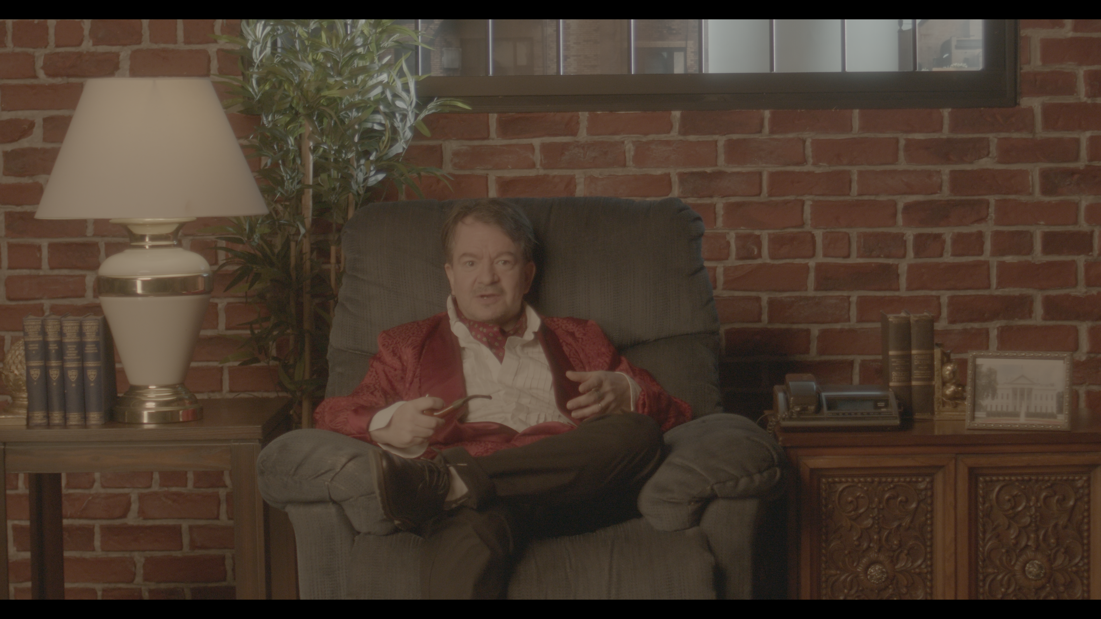
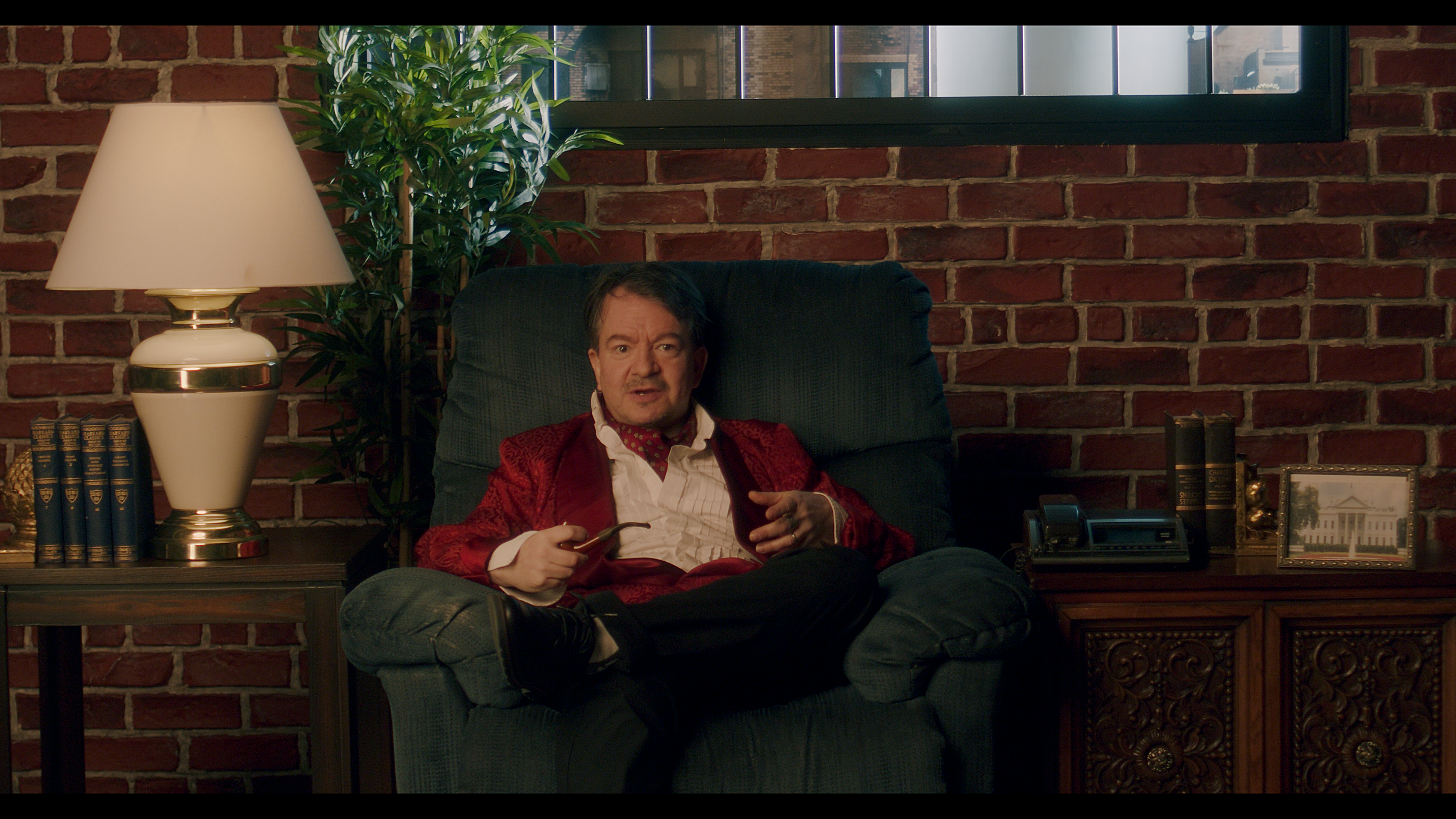
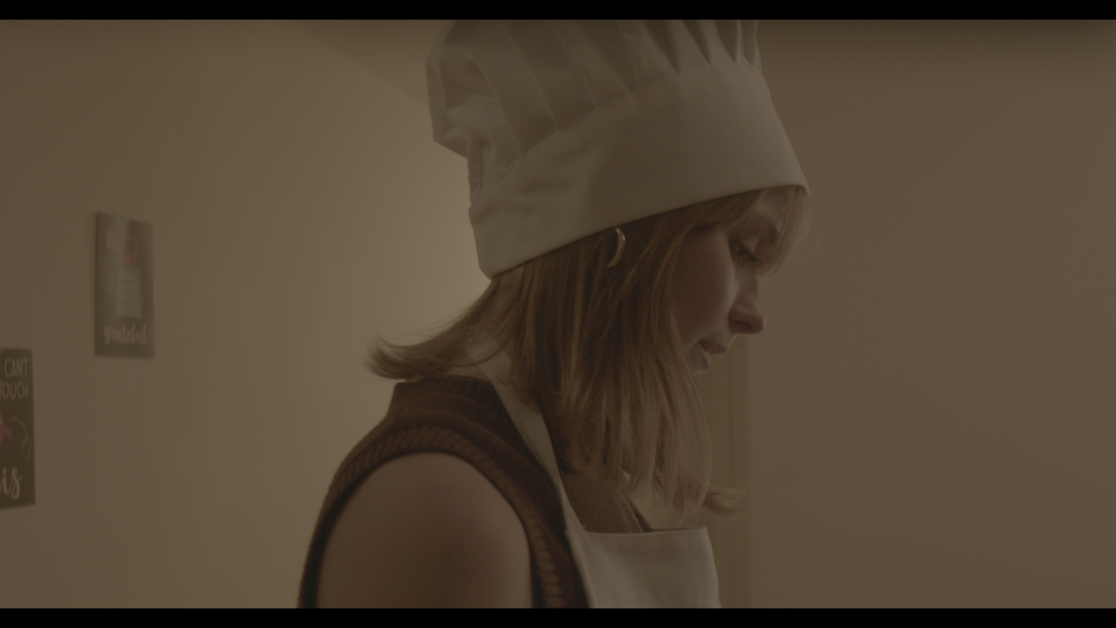
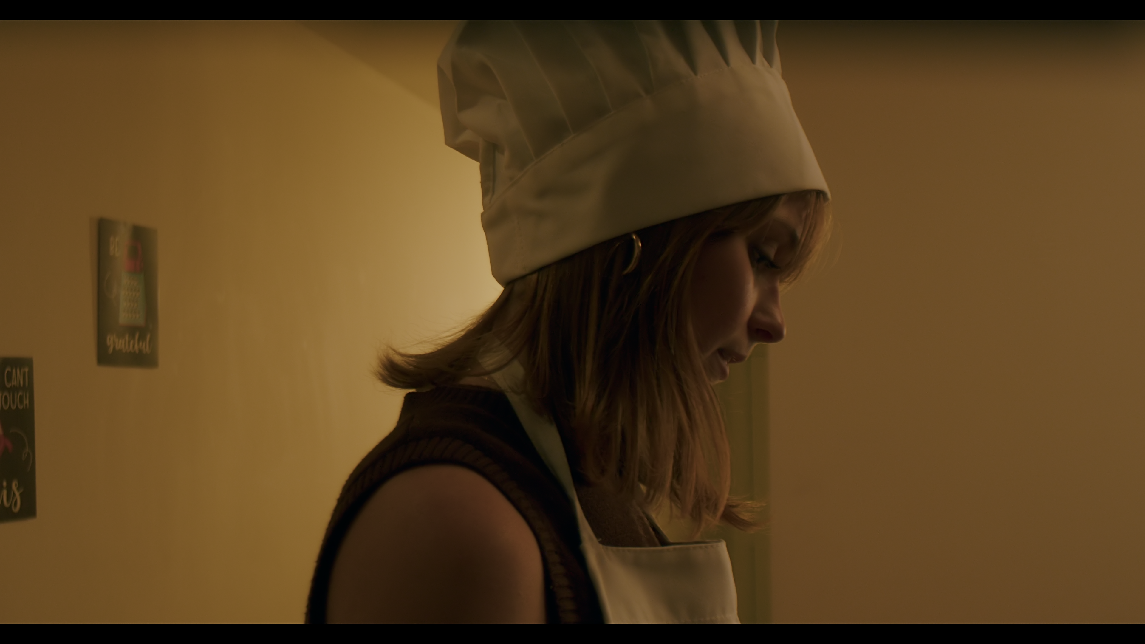
The grade for Gustav Spicy revolved around the variety of the film itself. The film did not fit one particular mood and although it was a comedic film, plenty of drama and tense moments were present and coupled, of course, with moments of sillyness and hilarity. This caused the look of the images to be reliant on the scenes themselves. The studio Gustav Spicy look for instance was a look I cultivated with dramatic elegance in mind, like that of whiskey commercials seen on TV. To achieve this I decided to crank my shadows down to the point of almost losing information yet retaining just enough to see the detail. In addition to this high contrast approach to the look I focused on making Gustav's clothing pop by shifting the color and luminance of his robe to be a highly saturated crimson red. I replicated this technique on the chair he sits in by bringing the luminance down (to contrast his robe) and shifting the color to a dark blue rather than leaving it as a neutral lighter blue chair. I used this same philosophy for the dramatic scenes of the film with the protagonist. For the more light hearted scenes I aimed to keep the level of saturation in the clothing the same, making this the anchor for a consistent look, and instead made minor adjustments to the skin tones and the contrast of the scene. To signify a more lighthearted time in the film I decided to focus on bringing out the red in skin tones more and balancing my shadows so that my blacks were no longer sitting so close to 0.
Gen5/B-Raw
Colored
Gen5/B-Raw
Colored